Interview – In Conversation: Jimmy Limit and Christopher Schreck

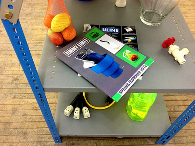
Christopher Schreck: I thought we could start off by discussing your recent book, Spring/Summer 2012. Before we get into the photographs themselves, I wanted to talk a bit first about the book’s presentation, which adopts the format of a Uline catalogue. Was that decision made prior to your selecting the materials used in the sculptures?
Jimmy Limit: It actually started with the photographs. They were inspired by Uline, but also more generally by things like stock and instructional photography, along with other catalogues like Sears. As I shot more, the images began to reflect Uline mainly through the materials I was using. So while I’d always had the intention of organising the final body of images into a book, it gradually took the form of a catalogue.
CS: So then what initially guided your decisions in choosing those materials?
JL: Well, once I decided on Uline as being the access point for the viewer and the overall inspiration, things definitely flowed much more easily in terms of the photographs. My previous projects had been more ambiguous, so I think that even ascribing that much meaning to the body of work was difficult. I actually just read your essay ‘More than Words’, and it resonated with things I have been thinking lately. I think Spring/Summer 2012 works because people recognise Uline, so even my family can appreciate it on a certain level, but there is a larger conceptual framework to it. You don’t necessarily need to understand this to enjoy the photographs, though – they are pretty funny/absurd on their own.
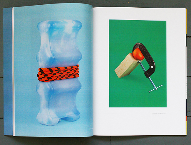
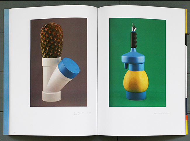
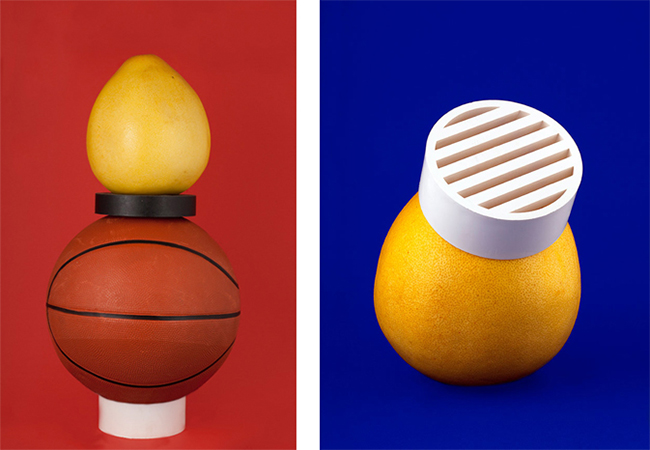
I went to dollar stores to buy materials at first, but by the end I was visiting hardware stores primarily. I was shopping as a photographer, though, and was avoiding items I knew the purpose of. In this way, I was buying things based on their formal qualities rather than their actual function, which in most cases I still don’t really know. I would also buy items that weren’t packaged so that I could return them after documenting them, just briefly interrupting their life cycle as they went on to be purchased by someone for their actual purpose. I bought most of the fruit in Chinatown and didn’t totally know what it was either, but it was a good snack following each shoot. Well, some of it wasn’t that good, actually.
CS: As far as assembling the sculptures went, were your concerns generally formal as well? In going through the book, I was trying to look for any suggestive combinations of items, but there didn’t seem to be much to indicate that sort of approach – at least not obviously.
JL: Each arrangement was purely formal and arrived at through play in the studio. Some objects seem to pop up in multiple photographs, but that wasn’t really planned – it was just one photograph at a time, or a cluster of photographs, using whatever I had strewn around the studio floor. Many of the arrangements were precarious and fell over right after the shutter closed, so as sculptural forms, they only lasted for maybe 20 seconds.
CS: Have you always had a studio? I think of your earlier work as favouring more of a documentary, point-and-shoot aesthetic.
JL: No! Before I was really limited in terms of equipment and facilities, so my photography was mostly point and shoot and prints were generally really contrast-y photocopies. Having access to a studio and equipment made me really want to learn to shoot with lights properly, and that’s part of how it all developed. You shoot a roll of tape on an orange as a test and something clicks because you just came from work where you looked at the Uline catalogue for 6 hours, daydreaming about being the Uline photographer instead of working at the retail counter of a film lab.
You actually quote something in ‘On the Still-Life New Wave’ that really resonates with what I was doing at the time: ‘[Some photographers] have, as [Matthew] Thompson asserts in his essay ‘The Object Lost and Found’, embraced a more traditional notion of the artist’s studio, recasting the space “as a site of making, not simply a site of production”.’
CS: Adopting this product/still-life style sounds like a pretty big adjustment from how you were working before – the process takes longer, it’s more technically demanding, involves premeditation, etc. What did you see as being the benefits and drawbacks of working this way? Was it any more or less enjoyable?
JL: Actually it was a bit of a compromise because I went from point-and-shoot to 4 x 5, which is much more involved than digital. I welcomed the digital process because you don’t have one sheet of film that is going to cost $3 to develop and there is a good chance your exposure won’t be great. With digital you can just shoot and check, make an adjustment, then shoot again. But at the same time, with digital, shooting is just the beginning. There was a lot of post work done on these images, so the initial shooting was really only half of it.
CS: Do you think of this work as being any more or less personal than your earlier work? Does that matter to you?
JL: I’ve never really cared about the personal aspect, and tried to avoid it with my earlier photography. When photographing each arrangement, I saw myself as more of a technician. I was just documenting these things in the same neutral style that a hired photographer would have. This aesthetic is really interesting though. I realized that my interest in it is this intersection between the intended purpose of the photograph, which is to communicate an idea or sell a product, and an unintended aesthetic quality that oftentimes the photographer doesn’t even realise is there. This is really where my interest in stock photography and commercial catalogue photography lies: these weird or awkward images – like the dog on the mattress box in Uline.
CS: In speaking about product and stock photography, it’s interesting to think that the photo’s aesthetic value can so often be accidental, since it’s such a meticulous and intentional brand of image making.
JL: Yeah, I mean the main goal of a commercial photographer shooting this stuff is really just to communicate what it looks like effectively, without any real creativity. Creativity on the part of the photographer is a negative quality in this context, as it can confuse the intention of the photograph for the viewer. So this aesthetic value might come from a lack of knowledge of plumbing equipment, but a plumber would just see a plumbing tube wrench or something. In some photographs, you will see a penny or a quarter, or I have even seen cigarette packages, to give you an indication of scale. Of course if you didn’t know these objects’ purpose, you would assume it was a very strange thing to add to a photograph.
CS: Let’s stay with that for a minute. One of the things that I find so rewarding about this body of work is that it evokes a number of very relevant art historical precedents. With what we’re discussing right now, I’d draw a connection to something like the “Involuntary Sculptures” by Brassai, for whom the act of photographing sculptural forms meant presenting everyday objects as something worthy of aesthetic consideration – setting aside their given functions or associations so that the viewer might encounter those items on purely aesthetic terms. I feel like a lot of these images reaffirm that idea, which would suggest to me that even the plumber could have a revelatory visual experience of that tube wrench if it was presented to him in or as a photograph.
JL: I do see a connection to Brassai’s ‘Involuntary Sculptures’, but perhaps more closely to Fischli and Weiss’s ‘Equilibres’ series. The photographs in Spring/Summer 2012 remain within the world of digital perfection, and in another context could be read as commercial photography, while Brassai and Fischli and Weiss, I would think, are stuck in the fine art side of things. In fact, part of the motivation for the book was also having it to show as a commercial portfolio. In this context, the photographs are looked at from a purely technical point of view – apart from the images being ‘weird’, I managed to get a few commercials jobs out of this project. I mean, it’s something inherent to every photograph that the context in which it is shown or placed will dictate its meaning, but in most photographs, this isn’t really a concern. Here, I actively thought about different contexts these photographs could be placed in.
The divide between use value and aesthetic value is interesting. Of course, there is actually someone designing all of these objects, with their forms taken into deep consideration, so they already should have some inherent aesthetic value, but this is, of course, always at the mercy of an object’s function. If we go back to the idea of the neutral photographer acting as technician, we understand that to them a pipe for an industrial catalogue is the same as a ceramic vase made by a master potter, is the same as an ancient Egyptian relic from the collection of a museum. They are all shot in the same way.
CS: I think this question of multiple applications is a crucial one, and the stock photography aesthetic seems like an appropriate vehicle for addressing it, since that brand of images is specifically meant to move between contexts. But I’m interested in something you said a moment ago, about this not being a concern with other types of photographs, since in recent years, those of us who present work online have been coming to terms with not being able to predict (or control) where our images might end up, or how they might be used by others. At least in this context, I don’t know if there’s a single type of imagery to which these ideas don’t apply.
JL: The fact is that once something is online, it’s out there forever and there’s no getting it back. I often think of archaeologists of the future mining through data to extract details of our everyday lives in 2013, and how awful and boring it will seem to them.
If I post something online, I try to have it exist in some tangible way as well, whether it’s in a book or actual prints. But short of putting watermarks on everything, there isn’t too much you can do online, so if you’re not open to your images taking on new meanings and uses, you are going to go crazy.
CS: Do you find that frustrating? Exciting?
JL: I think it’s great, but it’s also nice to be credited for something you have made. What do you think?
CS: Honestly, I don’t really see it as being positive or negative – it’s just the natural progression of things. That said, I do think it’s more productive to embrace and exploit these circumstances than to spend one’s time bemoaning or combating them. You’re always going to be better off treating change as an opportunity rather than a hindrance.
JL: You’re a glass half full kind of guy, I guess.
CS: Not really – I just don’t think there’s any sense in shovelling sand against the tide. As far as my own work existing online, I think it’s important to have one central location – my website – where things are presented intentionally. I feel like I’m responsible for that much – beyond that, it’s really out of my hands. That lack of control can be a strange thing, for sure, but it can also be enlightening. Personally, I get something out of seeing how the content I produce can end up in these strange corners of the internet, in contexts I never could have predicted. It gives me a different perspective on what I do. I also think that observing how images function online can be instructive in understanding how people respond to art. If anything, it tends to refute the idea that a given work might ever have a ‘correct’ reading or stable meaning, which is something I’m very interested in.
JL: I wanted to talk a bit about ‘Installation Views’. We have been talking about the photographer as a sort of neutral figure that documents things in a straight-ahead fashion. This is true in product photography, real estate photography, museum artefact photography, and arguably in the documentation of art exhibitions as well. When you were putting together this show of unconventional art documentation photos, I had to really think about if I had any of those myself, because I had always been in that sort of technician mode, although it has affected the way I now document shows. The way you approached it almost made it seem as though it was an unspoken – or unknown to the artist whose show it was – collaboration.
CS: One of the central ideas with ‘Installation Views’ was that the documentation process is an inherently transformative and thus creative act – like any other commercial product photography, its function is ultimately to create desirability, which usually involves some degree of idealisation, and which often results in depictions that stray to some extent from the physical realities of the objects being depicted. We tend to think of documentation as a culminating gesture, almost an afterthought, but it’s really about creating a separate work that lends itself to a separate viewing experience. It ends one narrative while beginning another.
In talking with you and a few other documentation photographers, what became really interesting to see was that while the process does amount to a kind of collaboration between the photographers and artists, if anyone’s unaware of that dynamic, it seemed to be the photographers, who were generally adamant in characterising their input as technical rather than transformational. They’d readily acknowledge the amount of intervention and post-production involved, but because those decisions tend to be dictated by convention rather than personal creativity, they didn’t see the process as being at odds with the presumed neutrality of documentation imagery. For Sofia and me, this raised some really interesting questions: namely, in a climate in which manipulation is so pervasive, even expected, is neutrality effectively measured in degrees? Can a depiction be at once mediated and objective?
JL: That is quite interesting. Take something like electrical sockets: these are really inconspicuous things when you are in the actual space, but they stick out when you view the images. Removing them is a simple task in Photoshop, but then how do these compare to install photos of previous shows where they have not been edited out? Do become less valid to the viewer?
Another issue is that more people now see documentation of shows online than see the actual show, so the documentation becomes the final say of the installation. Lighting will change so much when we see a show in person, but we don’t even notice it. Tungsten will create a yellow cast and natural daylight mixed with artificial lighting will do bizarre things too. In a photograph, we notice these things right away – or if not, when we compare a photograph where the walls have been desaturated with a photograph where the walls have not, we see a huge difference. So if someone sees the show and then sees a photograph of the show, they will most likely associate their memory of the show with the photograph. If something was different in the actual show than in the documentation, it is rare that they will acknowledge this. They are more likely to question the accuracy of their own memory and assume that the photograph is the correct version, even though it has probably been heavily edited in Photoshop. Due to the fact that the official documentation is in most cases the only record of an exhibit (although with larger exhibitions and museum shows this isn’t necessarily the case), these photos are the objective view of what it was. So hopefully the photographer was somewhat skilled.
CS: Well, like Szarkowski pointed out, we always give more credence to images than to our own perceptions, simply because the image survives the event, and over time gradually replaces it in our memory. It becomes the remembered reality. But that’s assuming we’ve even directly seen the work or exhibition to begin with, whereas art documentation’s function has generally been to provide accurate depictions of items not readily accessible to us.
To me, just the fact that we’re so comfortable allowing images to stand in for physical artworks is pretty intriguing – especially in the context of today’s visual culture, which is informed to such an extent by the malleability of static imagery. At this point, most of us have developed a healthy skepticism towards the images we encounter; we’ve generally grown less inclined to presuppose their credibility. And yet, when it comes to art documentation, we still seem comfortable basing our perceptions and opinions of artworks on these mediated images, even when we know from experience how different their depictions can be from the physical reality of the work itself. There’s this wilful suspension of disbelief that seems to take place, which Sofia and I found really intriguing.
JL: I think media literacy has definitely improved – as you say, digital manipulation of commercial images is now common knowledge. Someone’s skin in an ad for anti-ageing cream digitally made free of blemishes seems obvious, but it is odd that when looking at documentation of a painting – one doesn’t necessarily think that maybe that green shape in the corner was slightly altered through perspective correction, or adjusted to make the painting ‘better’, which could totally throw off the composition. Seeing photo documentation of some sculptures often leads me to this idea that the real work is a photograph more than it is a sculpture, which I think has informed my practice. A lot of the time, I am more drawn to a photo of something than the actual thing itself.
CS: I often feel the same way, and I think it’s increasingly common among those of us who spend time looking at art, both online and IRL: we see documentation of work, we see the work in person, and more and more, we find ourselves preferring the image to the object. Which I think raises some pretty important questions, but which is maybe also not terribly surprising, simply because documentation seems to lend itself to a more precise translation of artistic intent. As you were saying earlier about the electrical sockets: with documentation, even the most seemingly trivial aspects of the viewing experience can be reduced, exaggerated, or removed if so desired; no information in the final image is negligible, no resulting effect is unintended. Whereas seeing work in person involves these other variables (multiple vantage points, environmental details, time) that are often beyond the scope of the artist, and which make for a more complicated, less immediate viewing experience. Of course, our preferring the images to the objects might also have something to do with the quality and presence of the physical artworks themselves. After all, nothing improves underwhelming art like calculated documentation.
JL: It is interesting now as well with the fact that most people use their phones as cameras, and how this has changed the gallery and museum experience. I saw a YouTube video demo where a 3D rendering of a location – a plaza in a popular tourist destination, for example – is created using amateur photographs found online. Each one of these mono-focal shots is combined to create a 3D replica of the original. It’s interesting to think about it being applied to a famous work of art – a Henry Moore, for example.
CS: It’s definitely an interesting idea, because the fact is that more and more of the images of artworks circulating online have been taken by people with no professional stake in their depictions. That’s a fairly recent development, and it’s really exciting, because it goes against what standard documentation usually does, which is present the artwork in a single, purposeful way, as dictated by the artist and/or institution. It’s so much messier now, which is great – by doing a simple image search, you get to see works from all of these awkward angles, from previously unseen distances, in various installations, and so on. It really can be an illuminating thing.
As someone who both shoots professionally and shows regularly, how do you approach documenting your exhibitions?
JL: I work documenting other peoples’ shows already, so I shoot all of my own work as well. It’s just easier that way, since I already have a process in place, but I am curious to see how someone else would shoot it. When I shot ’Show Room’, I took a really long time editing, and even considered reshooting. Much more thought was put into it than if someone else had shot it, and it got to a pretty ridiculous point. It involved a lot of post work – reduction, mostly, but there were additive elements as well. In fact, some of the items in those photos were not physically in the show.
I think the possibility for self-editing in this way is an interesting one. The photos may change further as time goes on, with things being added or removed.
CS: What kind of elements did you add?
JL: I mean, nothing too crazy, but I shouldn’t say.
CS: Can you maybe talk about what motivated you to do that?
JL: Ultimately, more people will see the documentation than will see the show in person, so it was really about getting closer to an idea of perfection than was attainable physically. You can compensate for marks on the wall, electrical sockets, weird lighting, and so on. Actually, when I proposed the idea of you reviewing it, I thought it would be really interesting because you hadn’t seen the show, so the review would be just based on the documentation.
CS: Well, I do think there’s something to that, because like I was saying earlier, my sense is that the documentation is as much a reflection of artistic intent as the installation or work itself. I feel like it might be interesting if, in reviewing a given exhibition, a critic were to consider the documentation as an active part of the artist’s or gallery’s presentation – comparing the installation and physical artworks to their corresponding images, discussing the various strategies employed in each, and taking stock of the overall effect. If nothing else, since both the critic and audience would have equal access to the online documentation, at least one part of the process would be unmediated.
In a way, these ideas lead me to a question I had about that show. I was really curious about your decision to display some of the physical objects along with the framed photographs. That struck me as an interesting, even counter-intuitive choice for a number of reasons – among them, the fact that it seems to go against one of the defining aspects of the still-life/product approach, which is this idea that by allowing the image to stand in for the object, the photographer can completely dictate the viewer’s impression of his or her subject – offering a single viewpoint, enjoying flexibility in the suggestion of scale, and so on. By including the objects, you seem to have willingly relinquished some of that control. Can you talk about what went into making that decision?
JL: Yes, great – let’s talk about ceramics! I know that on Banana Leaves you often post photo documentation of ceramic work, which is for the most part considered to be in the realm of craft, though more contemporary artists are using it as a material. While there were other objects in the room, there was a focus on the ceramic elements. These ceramics were all made from moulds so they are multiples taken from an original. I think the similarity here between photography and these ceramics is interesting. Each is a documentation or trace of an original ‘authentic’ object, but while a photograph can visually describe colour, text and shape, it doesn’t necessarily give an indication of the scale or texture and occupies only one point of view. So the combination of a photograph and a cast copy can more accurately describe the original object than either could on their own.
I also included objects that had been used in photographs, as well as objects that could potentially be used in photographs. There were typical things you would find in a stock room as well, like a bottle of bright-blue floor cleaner and cardboard boxes. In this context, these things were viewed aesthetically more than functionally, although each will serve its intended function at some point. It was just a period of interruption to consider their aesthetic value. Of course, one can make a bottle of blue floor cleaner look quite remarkable in a photograph through lighting, digital work and scale, but in the stock room, it was just waiting to be used for something.
CS: So in the end, did you think of the show as an encapsulation of the book project? As an extension? How did translating the work into a gallery setting affect your own sense of the work?
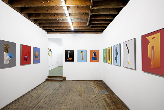
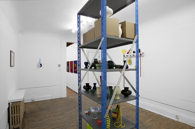
JL: While making the book, I was always considering what an exhibition would look like. The space at Clint Roenisch Gallery worked really well because of the two rooms. The front room was viewed as the ‘show room’, where sample prints were hung in standardised framing. The grey frames used the industrial technique of powder coating so as to retain some element of industrial supply. The back room was used as a ‘stock room’, where items were stored on a powder-coated central shelf resembling a column in the middle of the room. The stock room also followed the logic of the artist’s studio, with objects recently photographed or waiting to be photographed as well as works in progress, all of which were suspended in a sort of stasis for the length of the show. Two photographs hung there as well, which represented the beginning of a new series involving those ceramic forms that were on the shelf.
If nothing caught their eye when viewing the photographs on the wall in the show room, potential buyers were encouraged to look through the catalogue as well. So there were discussions like, ‘Well, I like the red background, but the form doesn’t really do it for me.’ The order of the photos on the wall was also changed for people to see new possibilities for hanging as diptychs and triptychs. The catalogue is such a low form of commerce that I thought its potential when applied to the high culture of the art gallery could produce fascinating results. The book on its own deals with ideas of value and commerce, so the transition to a commercial gallery was seamless, and I think helped to develop some of the ideas in the catalogue further.
CS: Beautiful. Alright, Jimmy – congratulations on an exceptional body of work, and thanks for the great conversation.
JL: Thank you!