Interview: Sara Cwynar
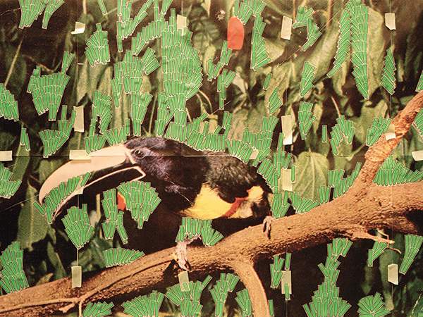
Toucan in Nature (Post it notes), 2013
Jareh Das: Cutting, pasting together and assemblage features heavily in your works. Could you describe your process, i.e. do you start with an overarching theme or is this informed by everyday objects you encounter?
Sara Cwynar: Most often, I will find an image somewhere (I am always trolling old encyclopaedias, the New York public library, flea markets, photo manuals and many other sources). I will scan the image, enlarge it often to many times its original size, then rebuild the picture out of laser prints so that it is a large version of the original image tiled out of many smaller pictures. This started as an economic way of working (building a big image out of many small ones) and also a way of working that comes from graphic design, and now I keep doing it because it further confused the plane of the image – ‘Gold nyt’, or the floral or toucan images for example, have depth in the original which is confused by the seams and tape on the surface of the reprint. Then once I have the new image, I rebuild it using different techniques – sometimes out of one object or material (for example, remaking natural foliage out of synthetic plastic arrow stickers in the toucan image) or out of many found objects as in the floral still-lifes.
I have a general goal to deal with very mundane, vernacular imagery in a really devoted, tender sort of way, and also to achieve some sort of overview of the scope of this type of imagery – from landscapes to portraits, to commercial still-lifes – but a lot of the imagery and objects are things I encounter, and chance certainly has a part to play in the process.
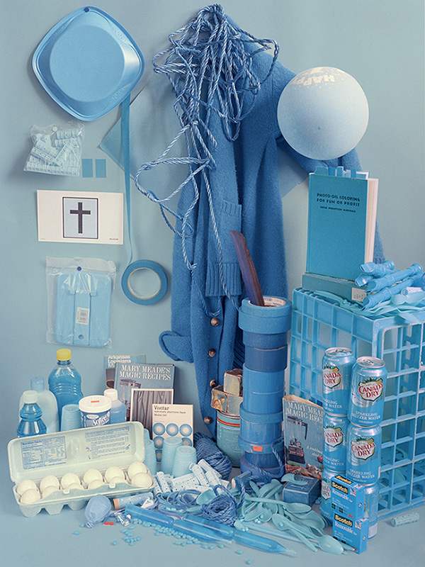
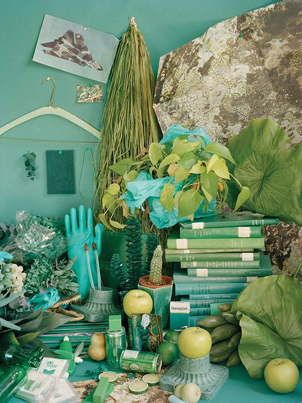
The floral arrangements or colour studies, for example, are made up of these sort of common, familiar objects that everyone has in their house – and my chance encounters with versions of these things that have been discarded, using different categories (colour, or the form of an earlier found floral still-life) to organise and represent these things as new pictures.
I’m intrigued by both the humour in your titles, the emphasis on subject, and their materials. Titles such as ‘Corinthian Temple (Plastic Cups)’, and ‘Toucan in Nature (Post-It notes)’, reference both the subject and materials they are made from. This strikes me as drawing attention to the materiality of the works. It’s like you’re saying this is made up of familiar objects but reconfigured artistically. Do you agree?
I completely agree! I want it to be clear on some level what is happening if someone cares to investigate, and my hope is that the work reads as one thing and then reveals itself to be another, ideally, this would happen in the gallery or studio (in a physical space). Upon closer inspection than the initial look allows, these familiar materials like plastic cups and sticky notes reveal themselves. But I understand (and think a lot about) how much art exists on the internet now, and I understand that, likely, most of the people who view the work won’t get to have that physical experience so the slower reveal can maybe happen through the titles. I also think it’s kind of funny to have these semi-pretentious art titles that describe really cheap everyday materials. A little bit of questioning of what should be shown in a highly produced art photograph, and having an image that initially looks very fancy be made of something very cheap.
Gold – NYT April 22, 1979, 2013
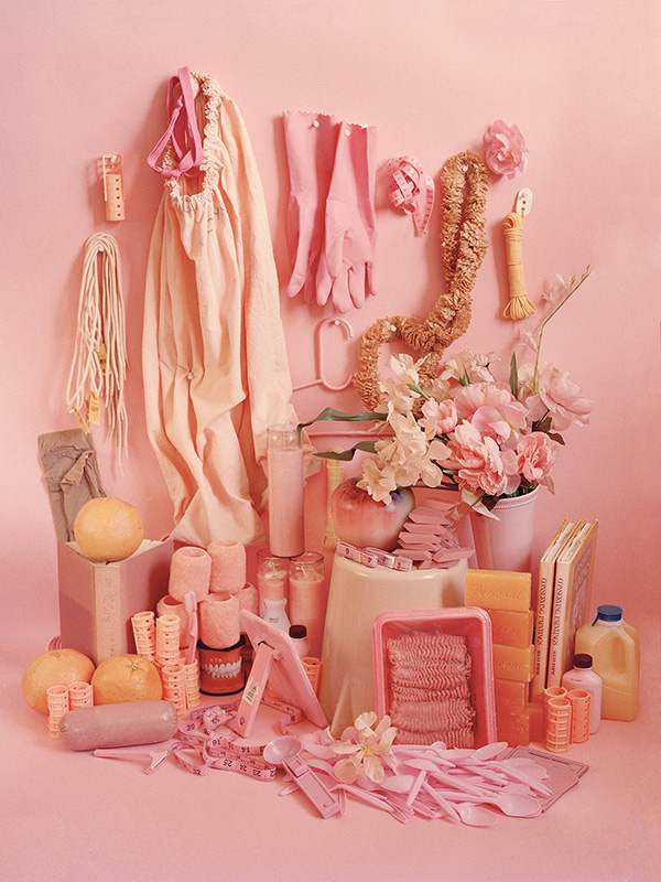
from the series Color Studies, 2013
It’s unavoidable to not reference the predominance of kitsch in the works. How do you feel about the snobbery of art history towards kitsch objects? This seems to be challenged in your photographs…
I love kitsch but I try (and struggle) to foreground and show my deep and genuine love of it – and have it not play as a sort of condescending acceptance of a lower art form as it is often viewed. I think kitsch is highly associated with the familiar too, with the things we know well and are sentimental about, and these are qualities that draw me to certain pictures. I am aware that kitsch is often a sort of mean-spirited or snobby adoption of something people in the specialised art world decide to take up or adopt, and I try very hard not to approach it in this way.
Can you talk a bit about your book projects and how you feel books give a different platform for engaging with your photographs?
Yes! I love working with books, it’s sort of my roots in an art practice. I am trained as a graphic designer and making books-as-art projects is how I came to art. I like the serial nature of the book, the potential in it to equalise a large number of images, making one no less important than the next, in opposition to the way that work in a gallery is often a smaller number of very preciously treated images completely extracted from the context you get in a book. And the democratic form of the book in opposition to the gallery: I think shifting between these two registers of importance, between a certain reverence for images and then a lack of that (when you have so many in one place) are important oppositions in my practice.
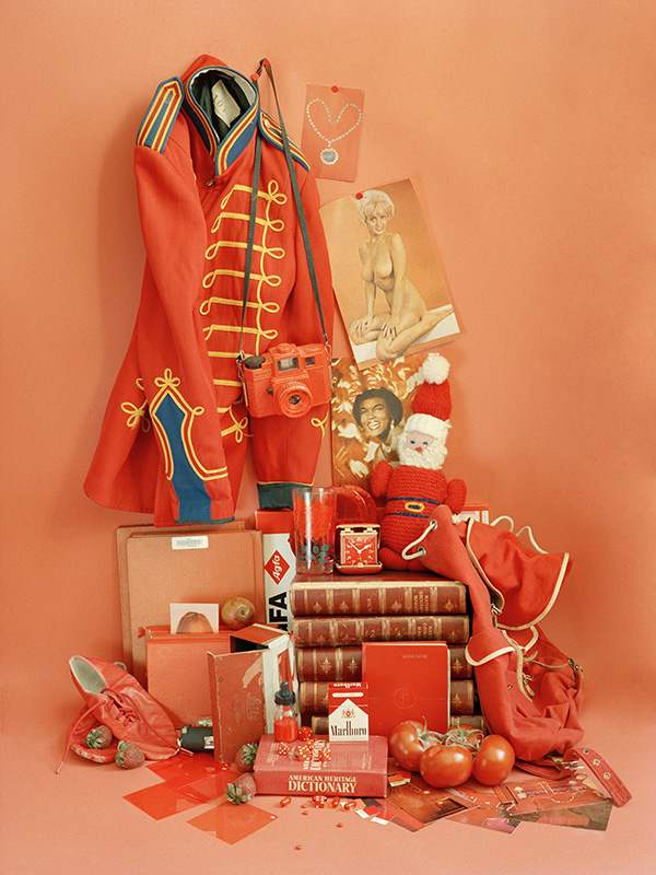
from the series Color Studies, 2013
In his book Chromophobia, David Batchelor describes how ‘colour is made out to be the property of some “foreign” body – usually the feminine, the oriental, the primitive, the infantile, the vulgar, the queer or the pathological.’ He goes on to describe how colour has been the object of prejudice in Western culture and explores colour as a positive value. I wondered how you feel about this seeing as you work with colour a lot? Do you get certain responses to your work that raise these issues of engaging with colour or rather a resistance to it?
Hmm, there is definitely some sort of feeling that colour is less valuable or less sophisticated – maybe ‘primitive and infantile’, though, that’s a really strong way to put it. The version of this that comes to mind is the idea in early colour art photography (Eggleston, for example), that black & white was the realm of fine art and that colour was somehow cheap, pulpy, not as valuable, that it provided all this extraneous information on an image that should be distilled and discarded in a really powerful black & white art image. This idea of colour being reserved for mass forms of imagery certainly draws me to it. As I said, I am interested in these sorts of overlooked or valueless pictures. I don’t know about colour being feminine! I like the potential of it to verge on ugly, and to date images to a certain time – like how some images read instantly as from the 70s or from the 50s because of a certain warping of colours. You can’t get this immediate quality of time passed with a black & white image.
What’s your favourite colour by the way?
Blue! I especially love royal blue. Also mint green and orangey-reds. I guess those are all nostalgic colours…
Forthcoming exhibitions?
My next thing is a group exhibition at M+B gallery, LA, in July, and my next book to be published by Printed Matter in the fall that I am currently working on. It’s called Pictures of Pictures.
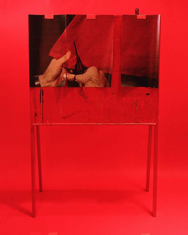
Cut (from Picturing the Times of your Life), 2013
from the series Color Studies, 2013
from the series Color Studies, 2013
—
Interview by Jareh Das / Published 30 June 2014